

The Aesthetic Collective: Lululemon
An assignment for my Social Media Strategy course kicked off a newfound creative outlet for me.
The brand I selected was Lululemon. I created an audit of their social media presence, made a few mock-ups, and realized how much I enjoyed it.
Through this process, I explored their brand voice, aesthetic, and engagement strategies. I then designed mock-up posts that mirrored their visual and tonal consistency.
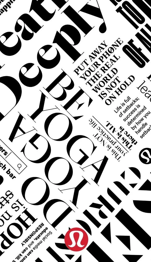
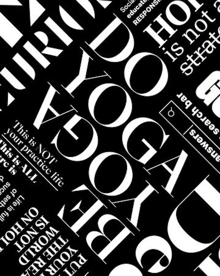
The various posts follow an aesthetic that the brand itself has set up, hence “The Aesthetic Collective” I created.
The Aesthetic Collective
The Aesthetic Collective

Lululemon’s refined, timeless, and minimalist brand image was the guideline for my own projects. I followed their cohesion across their platforms using their product launches and existing products.
I completed an audit, where I suggested strategies and tactics that could be implemented. Based on the audit and suggestions, I created mock-up Instagram posts and campaign pieces.
I built what I call “The Aesthetic Collective,” a creative extension of their brand world that blends cohesion, community, and calm sophistication.
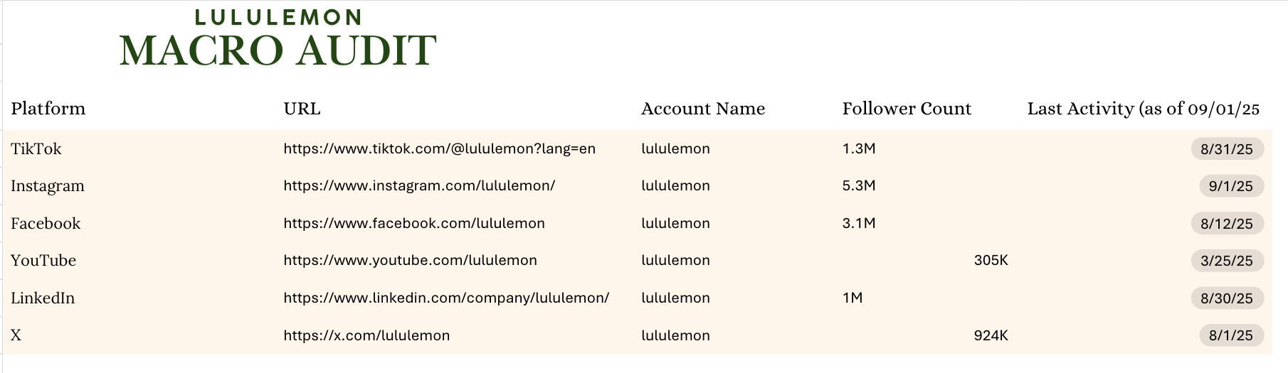
Lululemon Audit
Before creating my designs, I dove into Lululemon’s social media strategy from both a broad and detailed perspective. I began by analyzing Lululemon’s social presence through both a macro and micro audit.
The macro audit focused on the brand’s social platforms, exploring the statistical numbers and basic rundown.
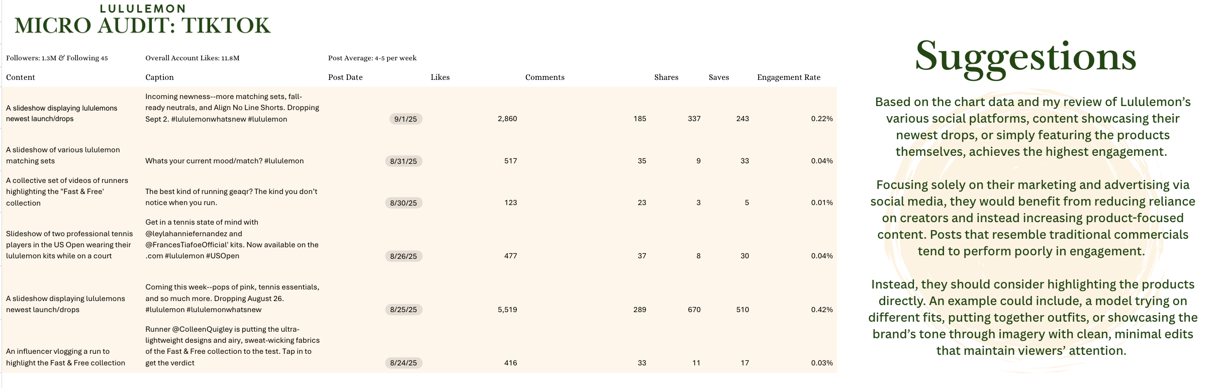
The micro audit took a closer look at Lululemon’s TikTok, where I evaluated their content, analytics of the posts, trends, and the statistics, such as likes and engagement rate. I brainstormed suggestions, ideas, and critiques based on the statistics I found.
These insights shaped the foundation for my next step: creating original mock-up content inspired by Lululemon’s brand voice and aesthetic.
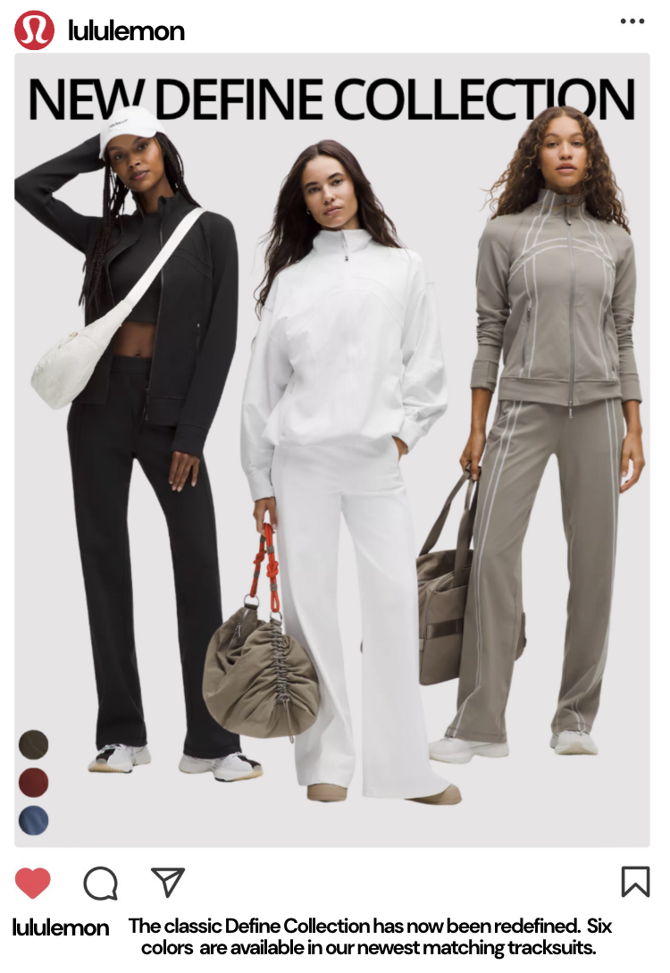
Instagram Mock-Up
Encourages engagement through subtle product reveal
In my audit, I suggested that Lululemon focus more on product-specific posts and collection drops. This mock-up is a follow-up of one of my takeaways, being the brand experiences higher engagement through product-focused content. This post introduces followers to the newly launched Define Collection. I also followed the brand’s minimalist and neutral aesthetic to match their overall branding and social media presence.
Neutral tones, color choices, and a clean layout reflect the brand’s identity.
The products remain the front and center of the post.
The other color options have been added below; therefore, the main ones used in the post are consistent with the brand tone
The first slide, which will be viewed in the accounts grid format, follows the brand’s social media aesthetic. This image is pulled from the brand’s website to further tie their social media and website platform cohesion.
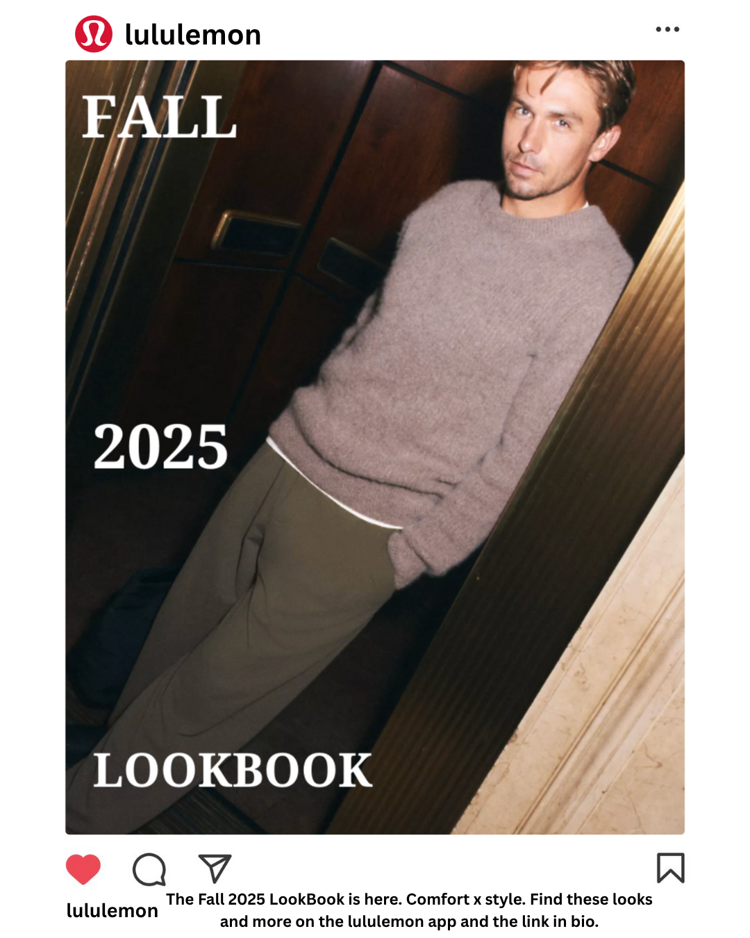
Lululemon Fall 2025 Lookbook Campaign
This campaign concept emphasizes visual storytelling through cohesion and flow.
The first post, formatted within the Instagram interface, demonstrates how the campaign would appear in a live brand feed.
The following slides display the full creative set, focusing on imagery, tone, and layout designed to maintain audience engagement throughout the carousel. The carousel displays a collage, followed by four looks pulled from new fall drops, and the pieces are labeled to the side as callouts for consumers to easy search on the website.

The collage was designed to appeal to a demographic of Lululemon who admire aesthetic and will give a peek into the following slides, which help with engagement

#E9D2C1
The texts placed on the sides are symmetrical with their vertical counterparts to create further cohesion and appeal

#A68E81

#AB9F99
Optional background colors for carousel posts, pulled from the colors of the initial slide